Case Studies

Scio-Gro
your Pantry, Fully Cooked
Design Exercise
Objective
Design a mobile app that maximizes household food utility and reduces waste by generating real-time, customizable recipes based exclusively on user-inputted inventory.
Timeline: 2 months
Tools: Figma
Role: Ux/UI Designer
Insights
For this project, I began with research. I turned to those around me for help and gathered input from busy moms, cost-conscious single-person households, individuals who both loved or hated cooking, and many others. I wanted to know what people would want or expect in this app.
timing is of the essence, especially for families with busy work/school/extracurricular activities-these families tend to need meals completed within a certain time frame
dietary preferences would be appreciated. Some nights individuals want certain cuisines
accessible cookware-not everyone has an air fryer
With these insights, I created different wireframes. I wanted to explore the possibilites and different layouts of what the app could and would look like while also incorporating resources or information that supported its branding.
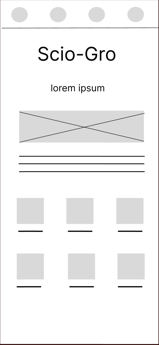
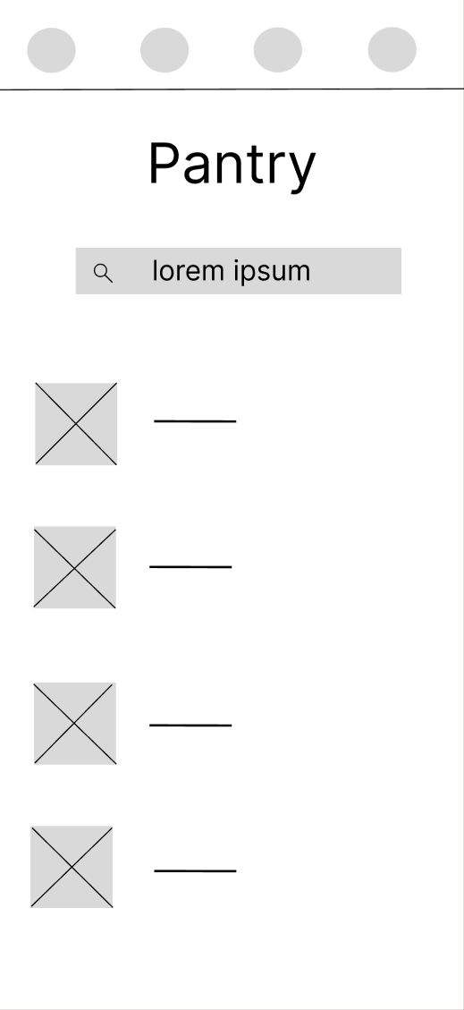
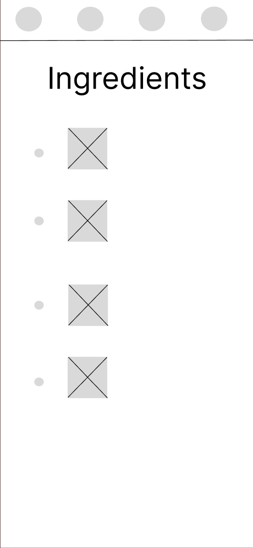
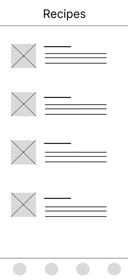
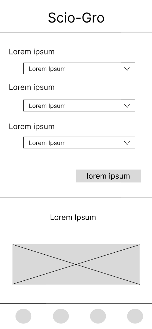
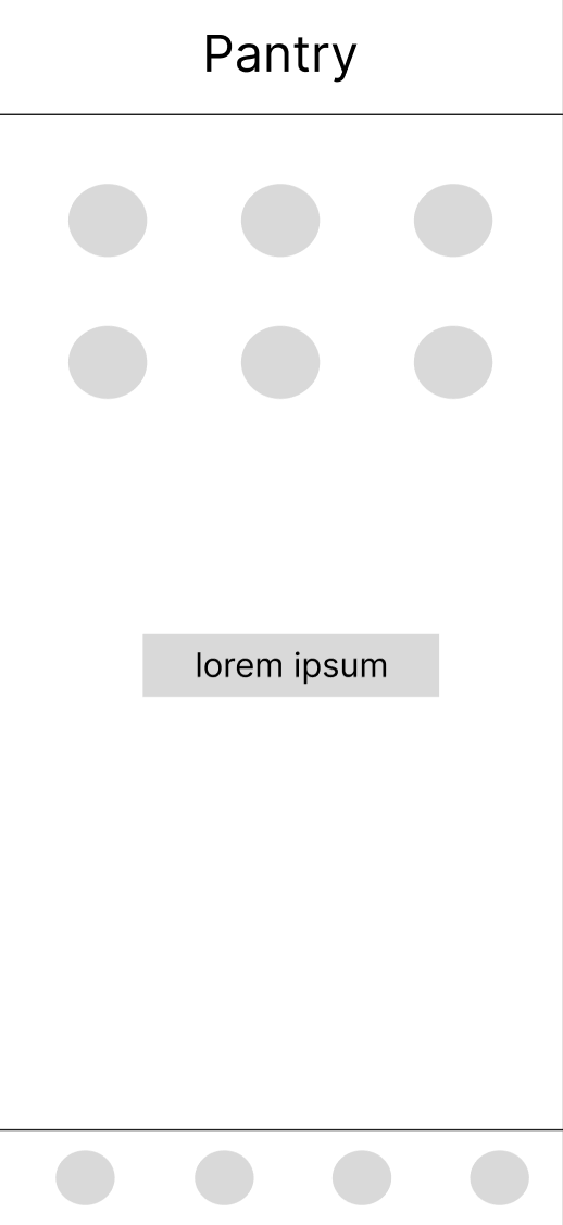
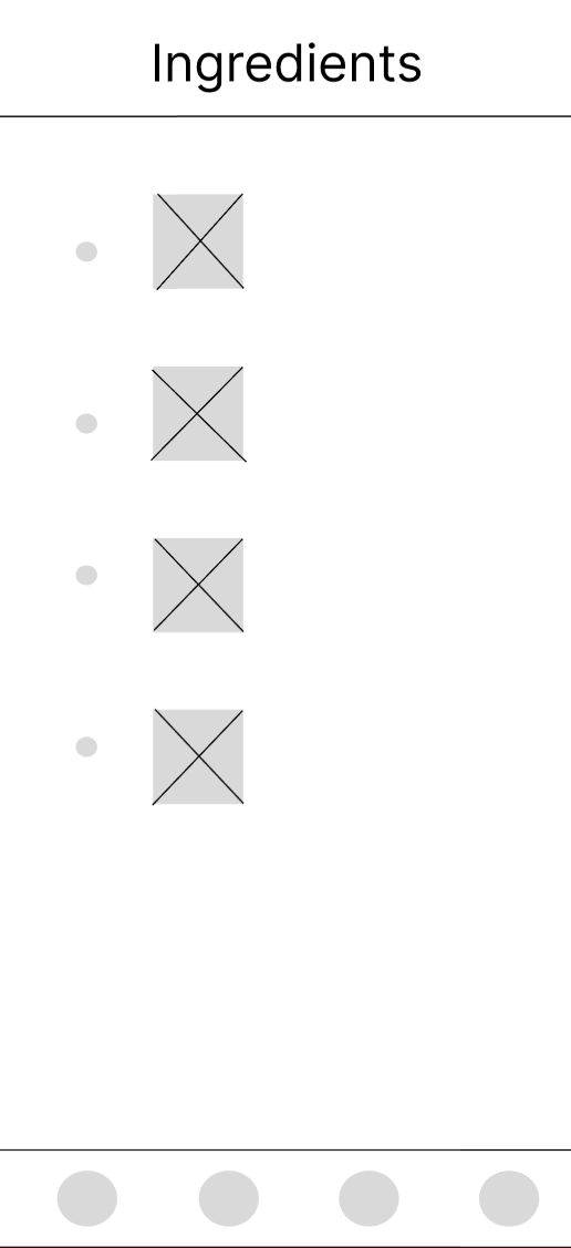
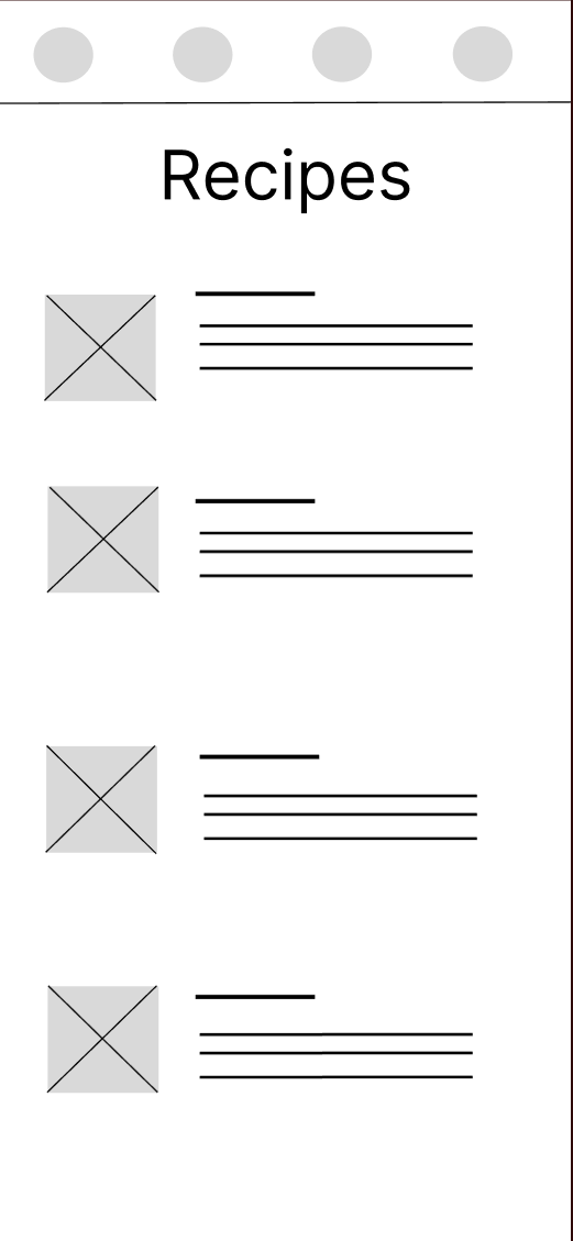
Once the wireframes were complete, I compared my designs with the insights gathered to make informed decisions on what worked and what didn’t, creating my first high-fidelity wireframe.
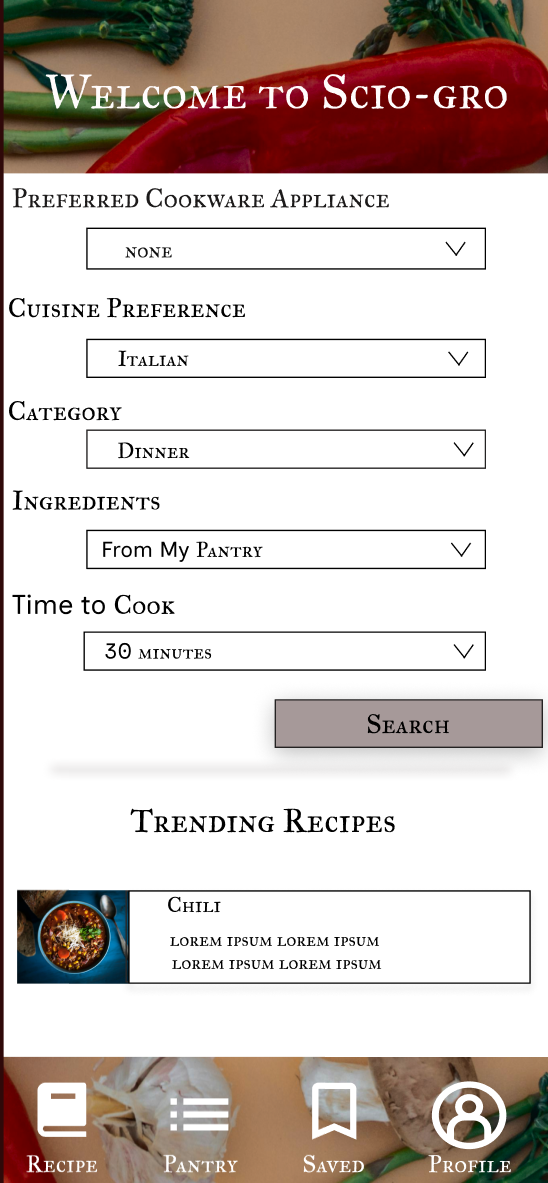
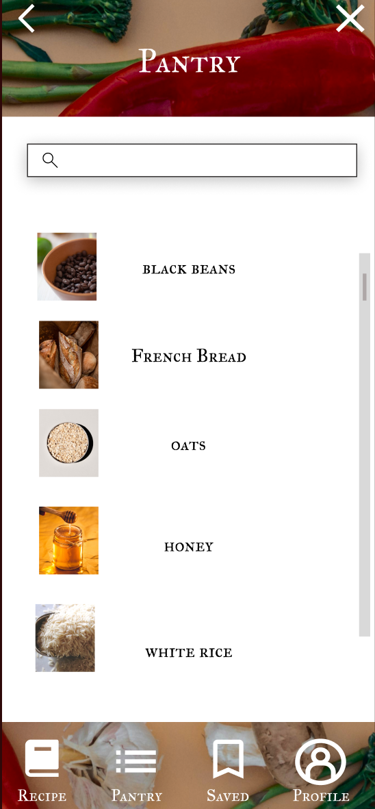
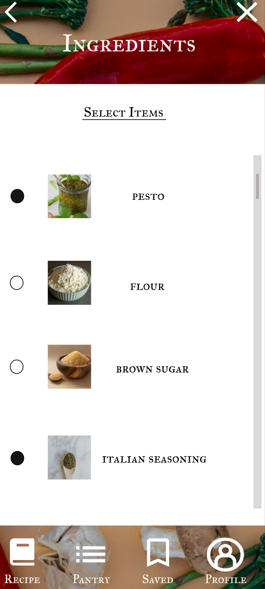
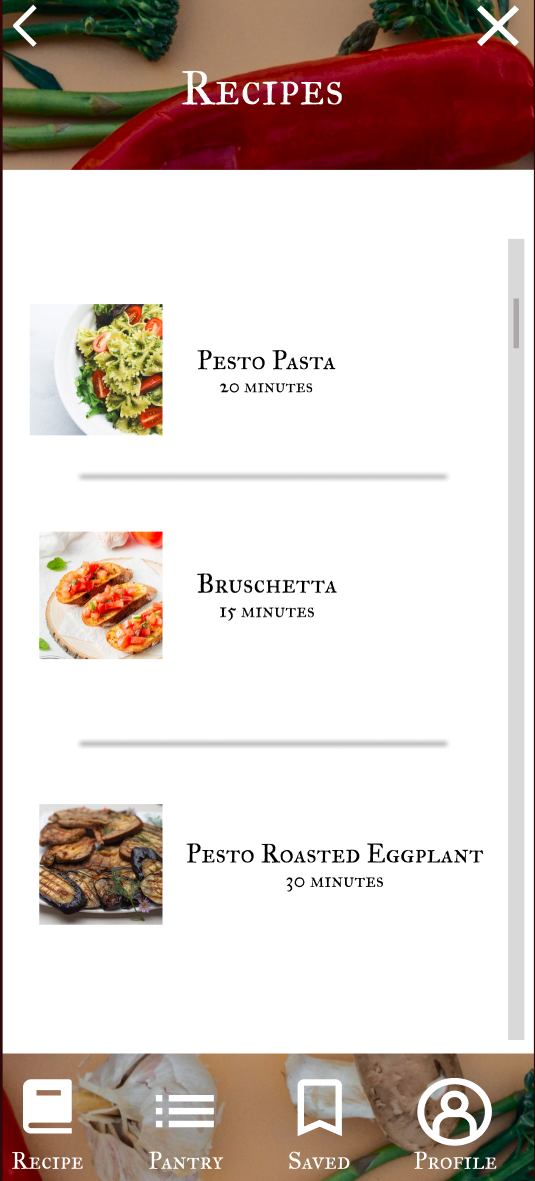
At this time, I wanted to gather feedback on if the app was meeting users needs. During the design process, I asked myself, will this choice make sense to them? Are the search prompts inclusive and clarifying enough? Is there any additional feature home cooks would like to see or find themselves needing? With these questions in mind, I created a hi-fidelity prototype for users to participate in synchronous remote usability testing.
Usability Testing Results
Based on the feedback from the testing, I created an affinity diagram and narrowed down the below troubles:
The recipe icon did not make sense for a lot of users. It brought users to the recipe page, however without the initial prompts on the home page, there wasn’t much more the icon added to the experience of the app
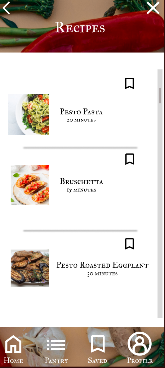
On the recipe page, there were many users who wanted to save recipes for later at first glance. The current design only allows for recipes to be saved if you click to open the recipe
users were confused on how to navigate the trending recipes. Some users did not realize there were multiple options to browse while others tried to view the other options but did not realize a swiping motion would be needed to see these additional recipes
Taking these insights, I returned to my prototype to iterate.
Iterations
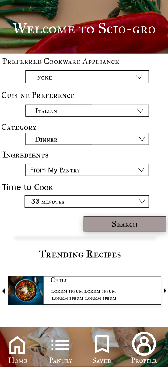
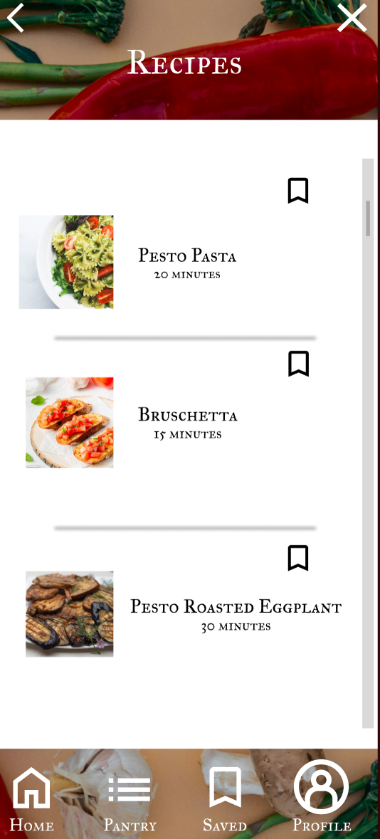
Based on user insights, I made the below changes to the above prototype:
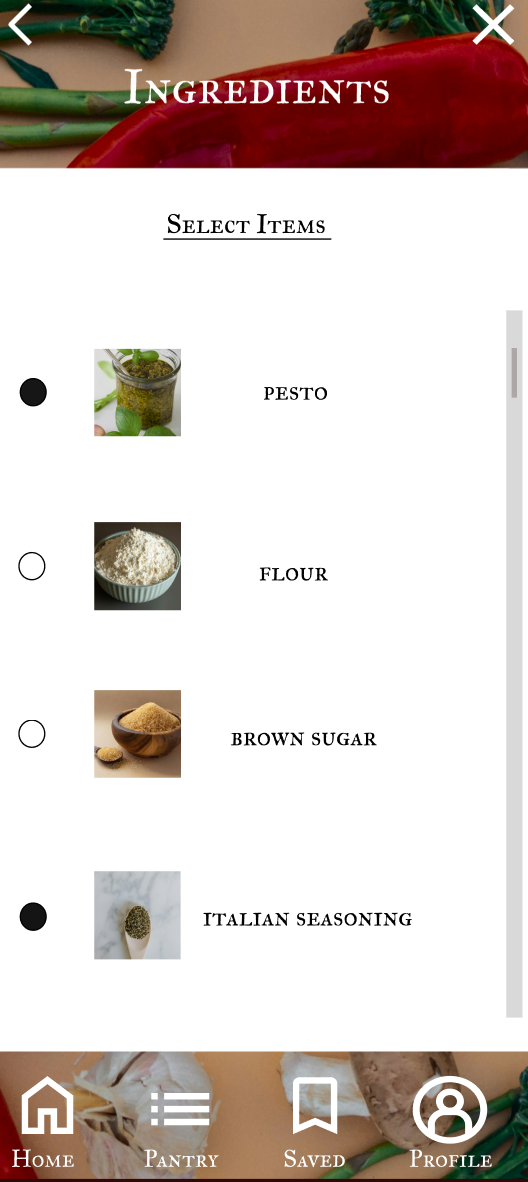
I added a call-to-action to the trending recipes where users can either swipe or press the arrow that corresponds to the direction they would like to go
I changed the recipe icon to a home icon to bring users to the first prompt page. This gives users a shortcut to make any changes at any time during the search process which solves the issue of a meaningless icon and creates a better user flow compared to the recipe icon
I added a call to action icon to the recipes page that allows users to save recipes at first glance. I decided on the same icon used in the navigation bar to keep consistency and clarity in the design
I then brought these changes back to my users to test again. This time, I decided to switch my test to a moderated usability test. I made this decision, because I wanted users to complete tasks that reflected the changes I made. I needed to ensure that not only did these changes work but also that they made sense and were practical for users.
Repeat Usability Testing Results
users found the home button helpful throughout their search process. More often than not, users tended to use the home button instead of the back icon when asked to navigate from the recipes page to the beginning
the save icon was successful in practicality and usability when users were given the prompt to save a recipe of their choice and then navigating to the saved icon to ensure the recipe of their choice was listed
the directional icons for the trending recipes were simple, clear, and easy for users to navigate.
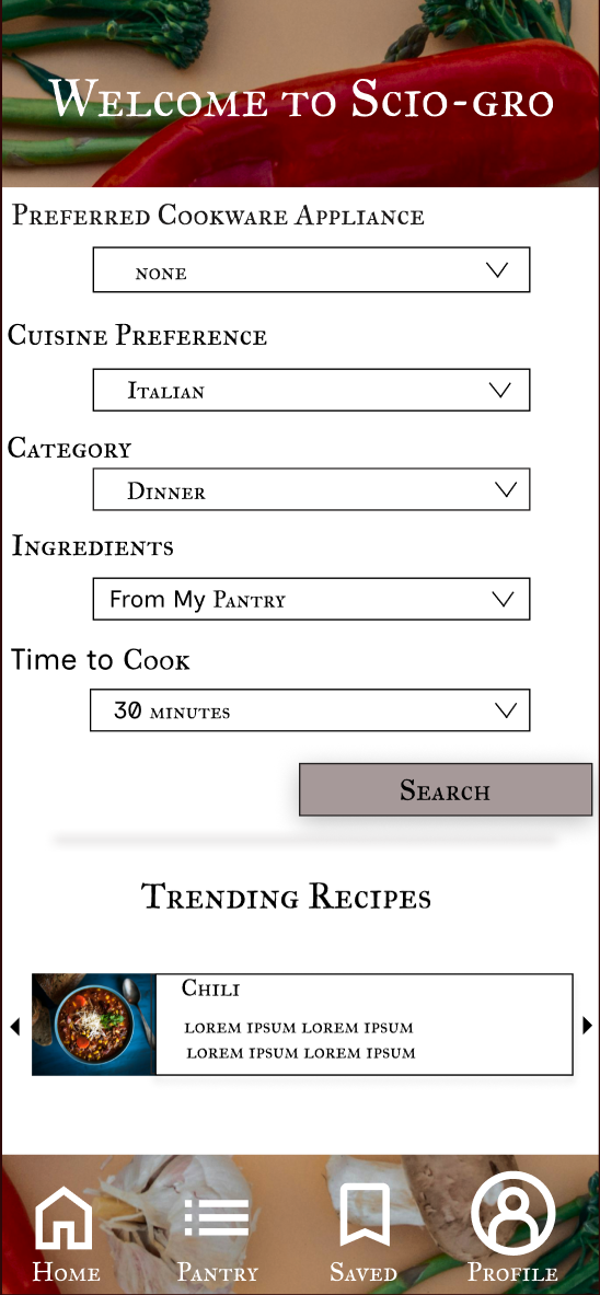
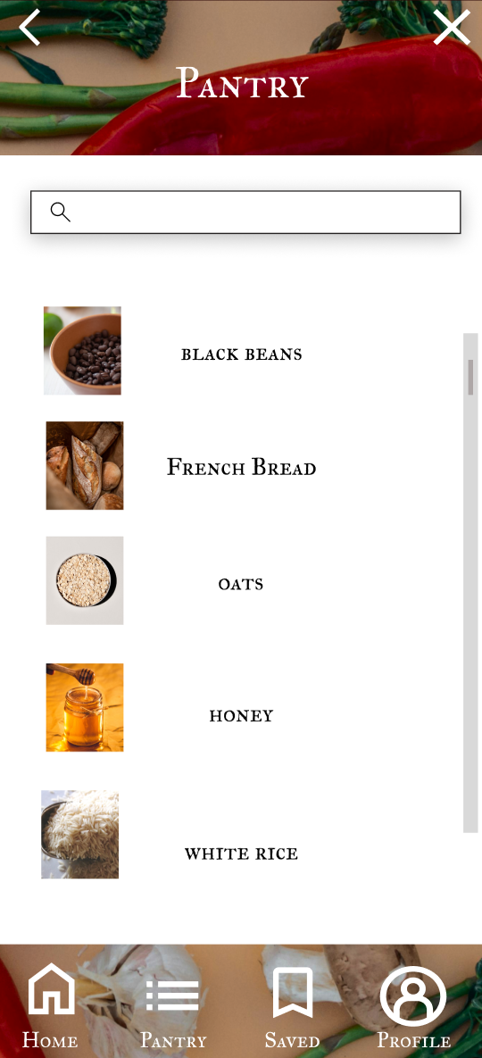
Overall, the repeat tests ran smoothly and showed successful iterations. Based on this second test, I combined the successful designs to create the final product.
Key Takeaways
What the users taught me:
Design decisions that make sense to me might not be clear to users
I assumed users would have wanted a more complex cooking app. I originally thought this would be an opportunity for home cooks to expand their repertoire, however this was far from the truth. Users taught me they prioritize tools that fit into their already existing lives rather than something to improve on or become a hobby.
What I thought:
If I were to do this over, I would do more research on competitor apps. In hindsight, this would have been more productive and a better use of time prior to creating the wireframes
A user insight that surprised me was an option to choose a cookware appliance. This was not something that occurred to me prior to gathering insights, however I feel it’s an important detail to include for accessibility reasons.
A way in which I would consider improving the app in the future is with possible integration with an online grocery shopping app. scio-gro can have an additional feature that moves pantry items to a “shopping list”. These items can then automatically be added or deleted from a shopping cart within the integrated grocery app just by adding or deleting the items within the “shopping list”.
Overall Learning:
test at every opportunity with new iterations
the type of testing chosen is just as important as the feedback given
People Grove
A Student Resource
Redesign Exercise
Objective
Design a mobile app for People Grove that empowers students to find and apply for career-building opportunities anytime, anywhere.
Timeline: 2-4 weeks
Tools: Figma
Role: Ux Designer/Redesign Concept
Research
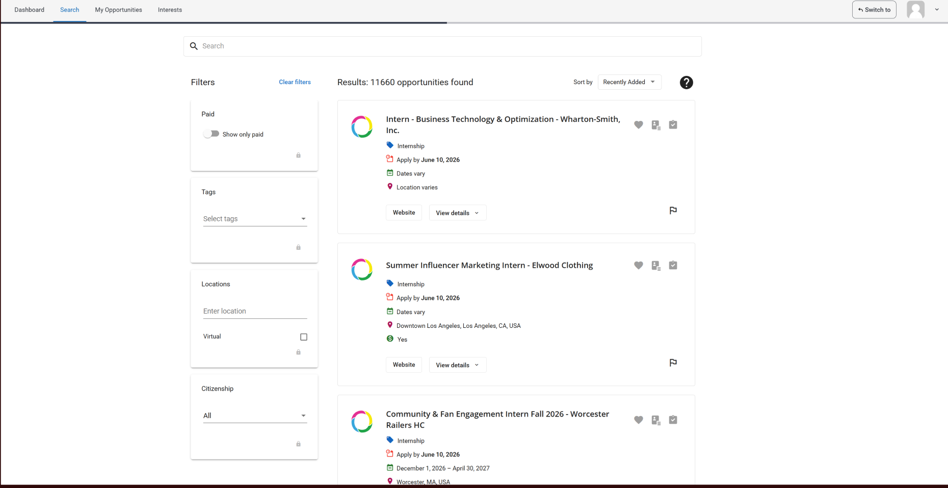
Instead of immediately jumping into creating a mock up of the current website, I decided my first step was unmoderated usability testing of the below designs. It was important to me to learn how users interacted with the site and reveal any existing problems. My purpose in this was to avoid a “copy-and paste” workflow, which could have duplicated user frustrations and prevented students from downloading or using the app.
Actionable Insights
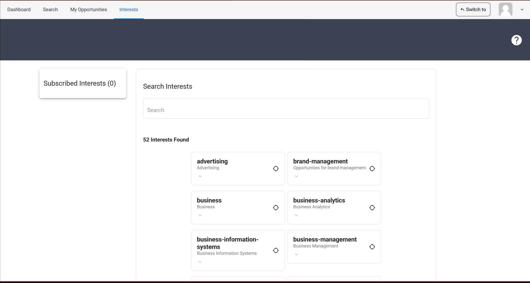
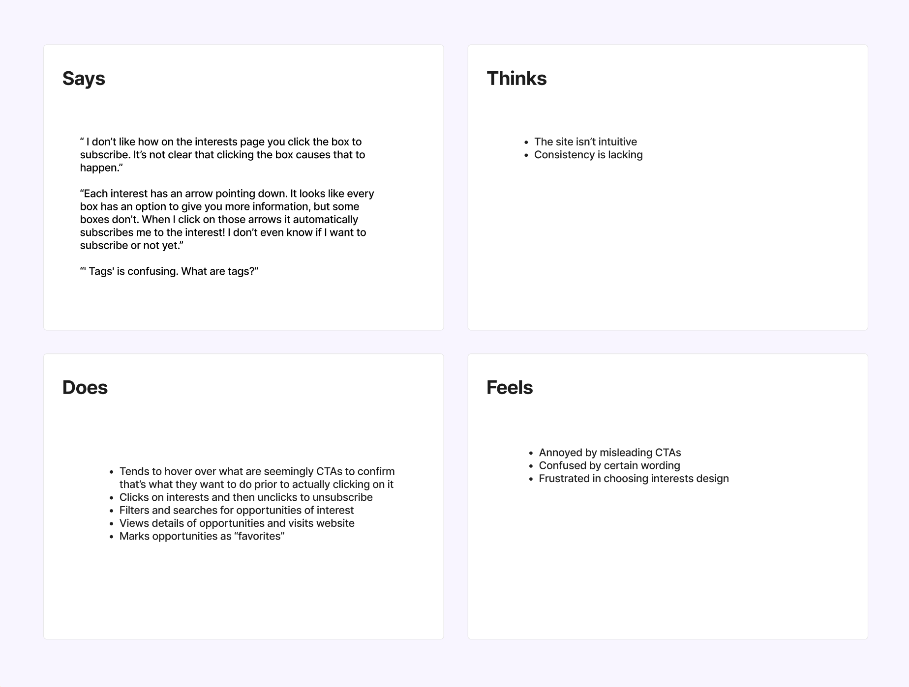
“ I don’t like how on the interests page you click the box to subscribe. It’s not clear that clicking the box causes that to happen.”
“Each interest has an arrow pointing down. It looks like every box has an option to give you more information, but some boxes don’t. When I click on those arrows it automatically subscribes me to the interest! I don’t even know if I want to subscribe or not yet.”
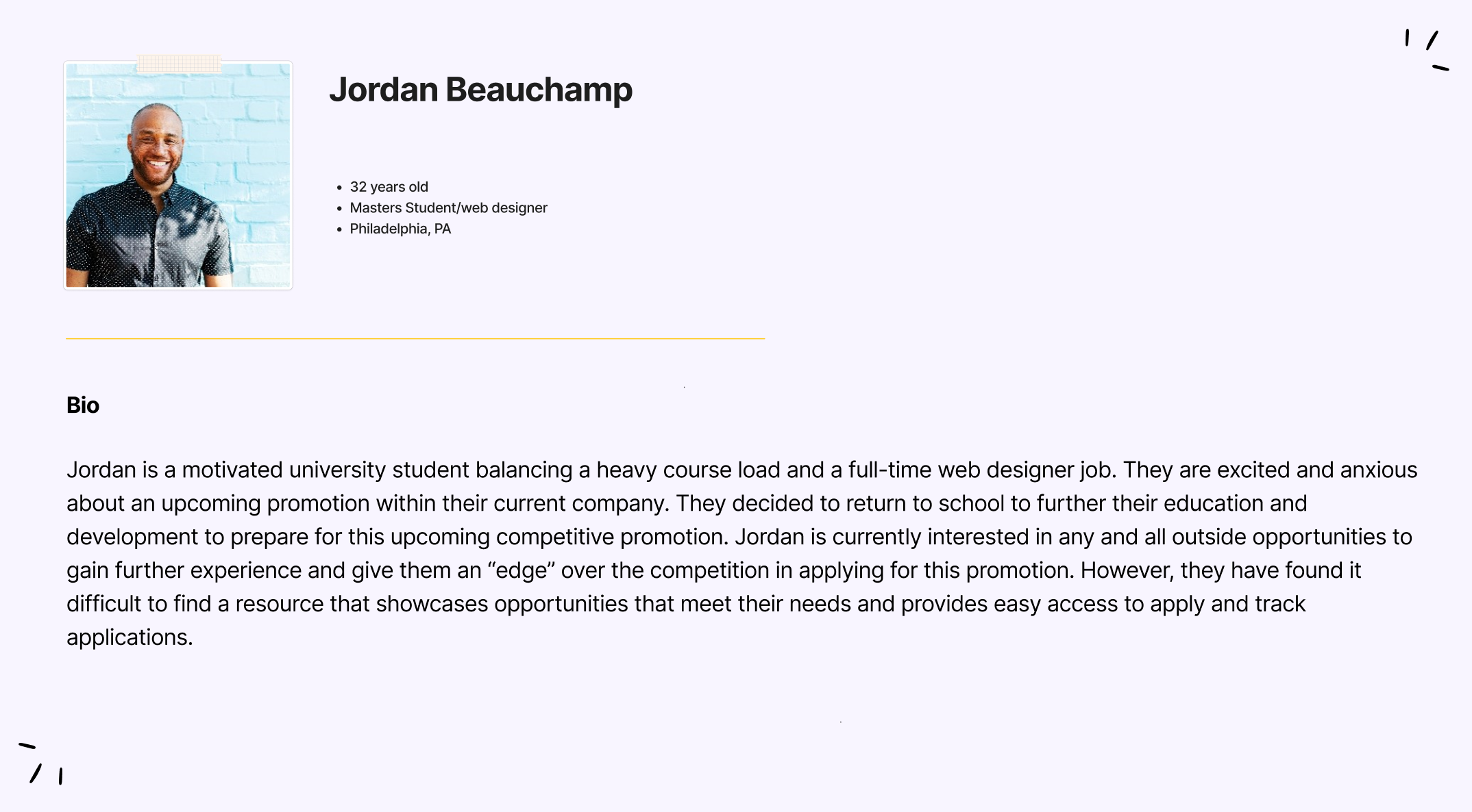
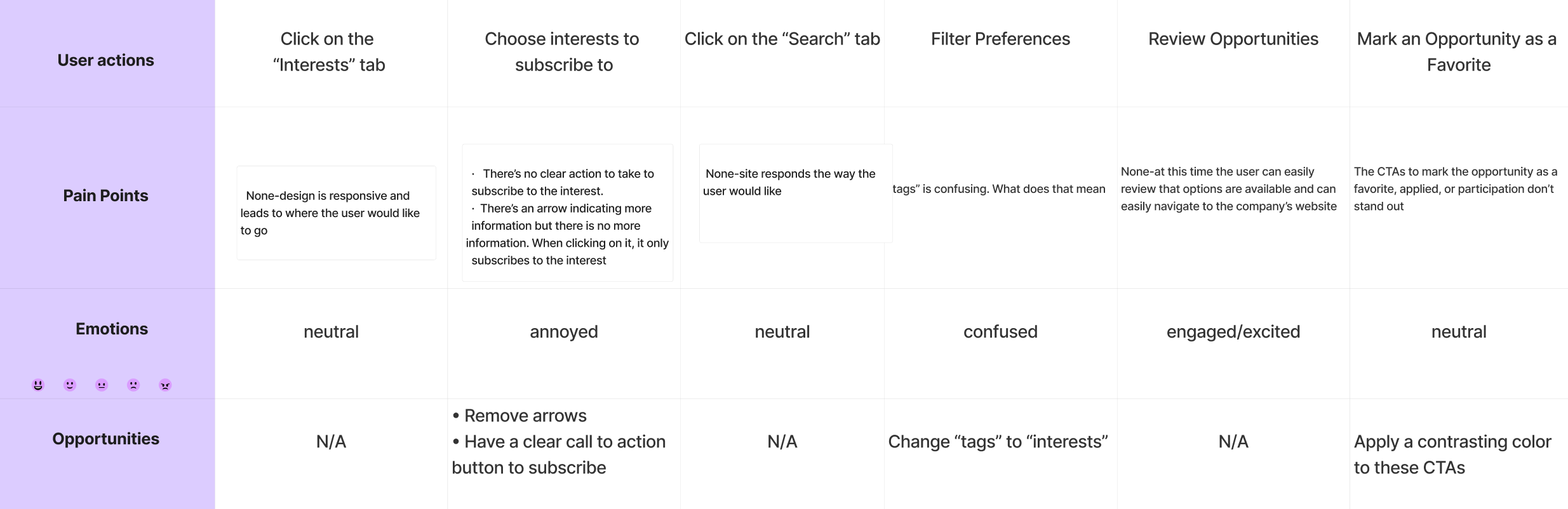
“' Tags' is confusing. What are tags?”From these user comments and usability research, I created an empathy map, user journey map, and user persona to define the problems and guide the first wireframe.
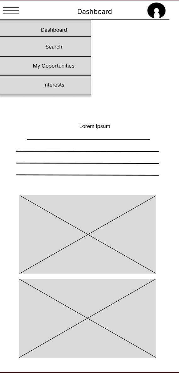
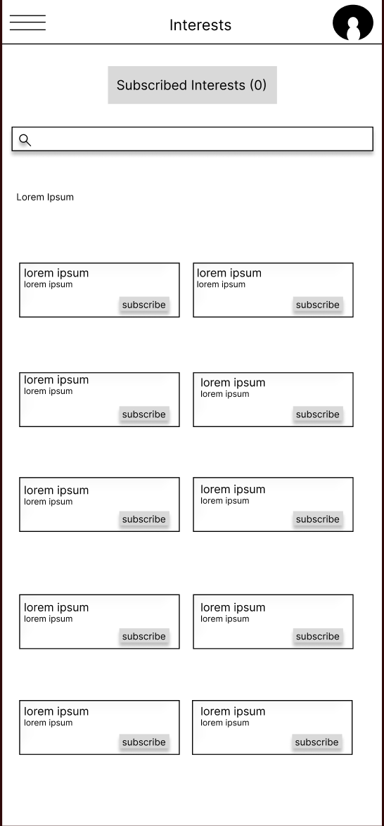
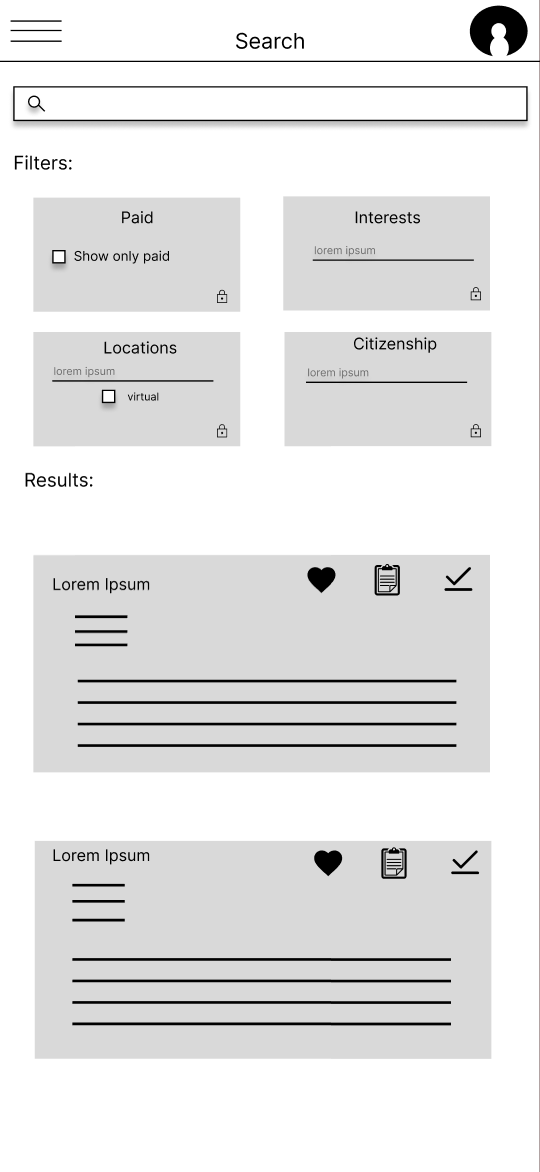
The above wireframes addressed expressed issues by:
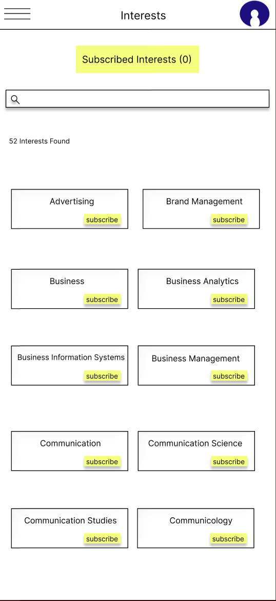
removing the arrows on the individual interests and adding a call-to-action button for users to click to subscribe
deciding to change the wording “tags’ on the search page to “interests”
Removing the arrows on the interests page was a choice to prevent users from clicking a non-functional button, which caused an unwanted action. In response to this as well, I created a clear call-to-action button so users would know exactly what to do if they wanted to subscribe to the interest and avoid taking an action they did not intend.
On the search page, I decided to change the wording from “tags” to “interests,” as “interests” is more widely understood and is consistently used throughout the rest of the site.
From this wireframe, I created a lo-fi prototype to repeat the unmoderated usability testing to which I received further direction.
Lo-Fidelity Prototype Actionable Insights
“Why’s there a lock button. What is that for?”
“I don’t understand why each interest is listed twice within a box. What’s the purpose?”
“The icons on the search page results are confusing. What do they mean?”
Reviewing the feedback from the repeat testing, I noticed the changes I made helped some, however the design still wasn’t intuitive enough. At this point I decided to go back to the drawing board and created three more wireframes that reflected the additional changes needed. I had the users review each wireframe and narrowed down the majority favorite.
Iteration
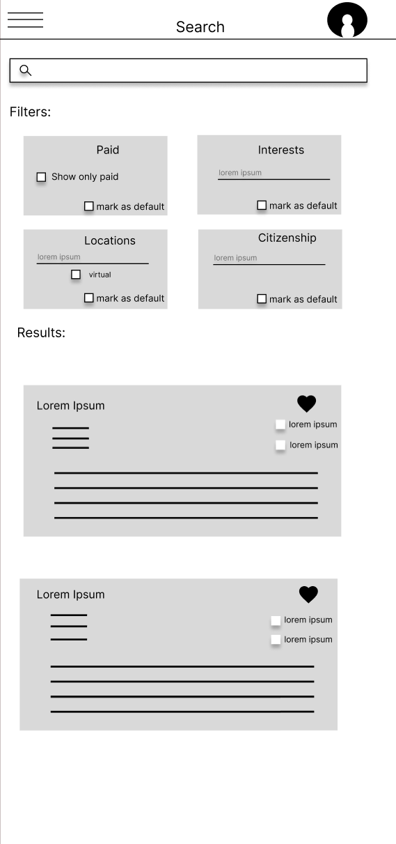
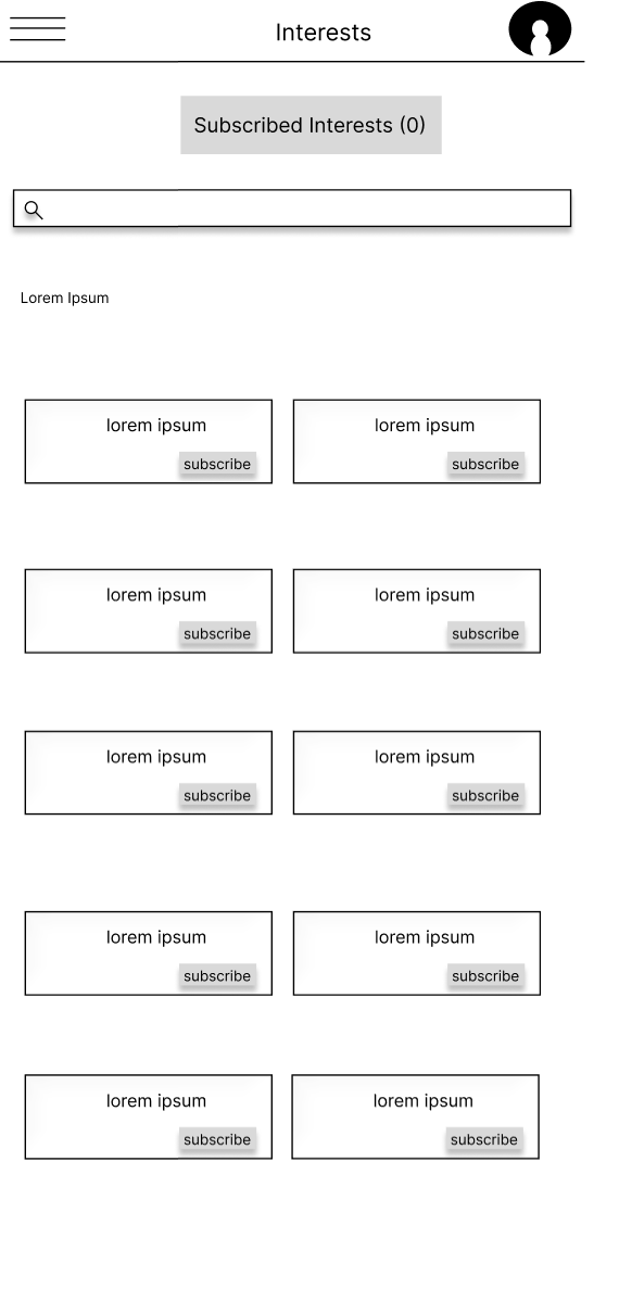
The above iteration addressed additional issues by:
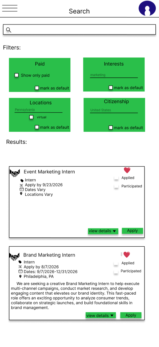
changing the “mark as default” icon to a checkbox in each filter option to provide clarity and improve accessibility. The original design does display an explanation if the icon is hovered over, although the typography is small and lacks high contrast against the background making it difficult for users that have trouble with their sight
removing the duplicate text under the interest label because it was repetitive, non-functional, and unnecessary
Changing the icons on the search page to more universally understood ones. I kept the heart icon as that is a common one used to indicate something is a favorite. I then decided to create check boxes for users to indicate whether they applied or participated in an opportunity as I felt labeling these options provided more clarity over icons which may lead to confusion or users clicking a choice they do not wish to make
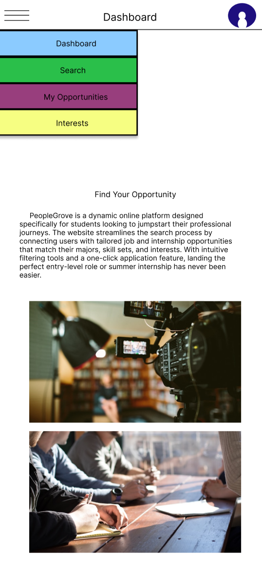
At this stage, I moved forward to a hi-fi prototype for users to complete a final usability study. In the hi-fi prototype I also made decisions to improve accessibility on the original design with contrasting colors. In deciding colors, I chose to use the brands colors. Not only does this create recognition for people Grove, it also assists users in differentiating what they click on. For example, interests is yellow and on the interests page yellow is used to indicate you’re subscribing to an interest. The same is said for the search page being green.
The final usability study was much smoother and the final product is shown below.
Key takeaways
What the users taught me:
The original design lacked clarity in all aspects
Users appreciate a simple path to search and apply for opportunities
Universal language throughout a platform, whether it be wording or icons, is important in providing clarity and accessibility
What I thought:
More features would add more value, such as a way to network with other students or companies
There is more room for branding and exposure to increase the amount of users and diversity in companies/students looking for opportunities
Overall Learning:
Test early
Narrow down not only what causes friction for users, but also listen to what they would like to see in an app and how these things may fit in their lives
Iterate, iterate, iterate
Not every design will follow the same steps in the creation process